Top 3 Things that you are Missing out When your Site is Not Mobile Responsive
Websites and Mobile Responsiveness have been one hot topics of discussion for several years now. However, the seriousness on this topic escalated to the next level on April 2015 when Google announced rolling out a mobile friendly update. Such an update from Google did convince/compel webmasters to take up the trouble of tweaking their websites to rank it well on mobile SERPs.
Even though, this update from Google forced webmasters to spend a tad more time in front of their systems, can you really blame Google for it? According to the statistics, the tendency of people to “go mobile “has doubled in the past couple of years. Most of the businesses that have been keeping track of this statistics have made their websites responsive already. Moreover, some of the smarter ones even made some very bold changes.
So giants are making their move already, so why can’t you? Believe me, there are people who see the funny side of the question and just answer, “We are not Giants”. Maybe you are a start up, but wouldn’t you love it, if you found your start-up being listed with these giants? You can’t say no to that, can you? Well, I challenge you.
So, making your website mobile responsive is the one thing that should top your web development checklist. If this is not the case, then you should definitely read on.
So let’s jump into the things that you shouldn’t but will miss out:
Mobile Ranking:
21st of April 2015, the Google webmaster central blog announced that, Mobile-Friendly sites are going to enjoy the limelight in mobile SERPs. As per the update by the mother-of-all -search engines, it will be against certain aspects like horizontal scroll, unreadable texts, unplayable content, page voids etc.
Google outlined some notable info about this update, which are listed below:
This update will only affect result on mobile SERPs across the globe and irrespective of the language preference.
The update applies only to the individual pages of the website not the complete pages. Literally transformed, if you have a website and two of its pages are mobile responsive, it is bound to get good positions in mobile SERPs while the rest of the pages can be lost in the inner pages.
In the present day, people like to browse ‘on the go’ and if the vital pages in your site are not optimized you are never going to reach those potential people trying to find services/products that you have on offer.
Knack of Engaging Customers on Page:
Most of the webmasters out there believe that, the job is done once you get people to visit your website, but this is hardly the case. Keeping the visitors to your website engaged is the real trick of trade that you should master. Google has stated that, some pages in your non-responsive website can show up on the first page in mobile search, provided, it comes with high quality and relevant content to the query. But there is something that Google doesn’t tell you here and is obvious.
Suppose, if you are still getting visits by this virtue, people visiting your site can easily find its user interface annoying. Since the site is not mobile responsive, it’s expected to come with voids, unplayable content etc. In such a circumstance, even if the respective page has valuable, unique content on offer, visitors can just bounce, simply because of the negative user experience that they had. This is literally going to increase the bounce rate and with time, your site which was not mobile responsive and yet on the first page on mobile SERPs is going to get buried in the inner pages of SERPs.
Business (especially, if you are a web dev company):
One thing that a mobile responsive site reflects well is professionalism. Even if Google hadn’t rolled out a mobile-friendly update, smart people are bound to measure a company by some features on their site and one of the features that they will definitely check against is mobile responsiveness. If you are thinking out of the box, a company whose website is made mobile responsive even when there is no pressure on it from any search engines, is a company that actually cares for business. It is with such companies that you need to do business with.
In case of a web development company, their website is literally the first impression and the best portfolio. So a web development company website that is not responsive can be easily compared to that of a ghost town.
How to get Notified about Mobile Responsiveness Issues with your Site:
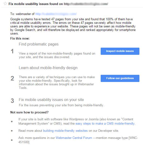
Google always have some means to inform you about the disparities tagged with your site. One of the major channels that it uses for this is Google Search Console (Formerly known as Google Webmaster Tools). Therefore, its strongly recommended that you link your website to an active Search Console account. So, if your site is not compatible with mobile screens, you are bound to see the following notification in Google Search Console:
How to test Mobile Responsiveness of your Website?:
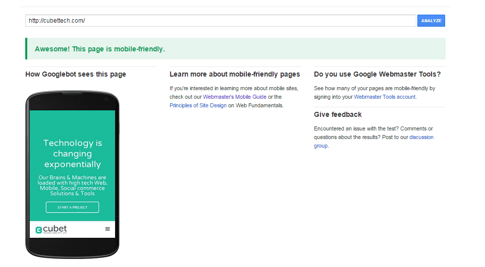
You can use Mobile-Friendly Test tool from Google to check the mobile responsiveness of your site. Let’s see how this tool churns out the results for both mobile responsive and non-mobile responsive site.
Result from Mobile Friendly Test for Cubet Techno Labs Pvt Ltd:
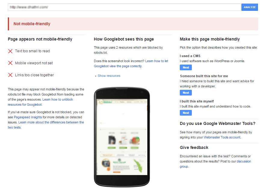
Result from Mobile Friendly Test for a Non Mobile Responsive Site:
Why go for Mobile Responsiveness?
Google has always stressed on the importance of making website mobile responsive one way or the other. The stats have always been on Google’s side too. As a matter of fact, 94% of local web searches in US are made via smartphones and around 77% of people use mobile to browse the web even when they are at home or office where they have easy access to a desktop. These stats point in a single direction and mobile responsive websites, seems to be the next best thing that could happen to your website.
So, have you made the decision to make your site mobile responsive yet (if it’s not already mobile responsive, of course)? I’d really appreciate it if you let me know how convincing this blog was in making the change. Yes, please use the comment box below and share this piece of content if you think it was worth the time. I’m planning to come up with a blog that highlights the common mistakes you need to avoid when making your site mobile responsive. Therefore, I’m looking up to your suggestions so that I can come up with a better blog next time.
- Share this


