From Nature to User Interfaces
Hi everyone, here is another post from the UI Design Team discussing mainly on selecting cool color schemes for your next project. Design is all about colors and how do we decide on the right color scheme? It sure is possible to make our user interfaces more pleasing and eye-catching by a simple easy tip. Anxious to know how? Well, keep reading !
What makes a color scheme eye catching?
Well that is a difficult question to answer. But if we give it a thought, we can observe that humans tend to enjoy the color schemes that is “programmed” in them. That means we seem to like the colors that nature has been showing us from childhood. For example, we all say “wow!” to the color combination seen in flowers, birds, sunrise/sunset, landscapes etc don’t we. There will be absolutely no one who would give a negative comment on any of the color combinations seen in nature. So why not utilize this idea and implement it in our own designs?
How do I create a good palette?
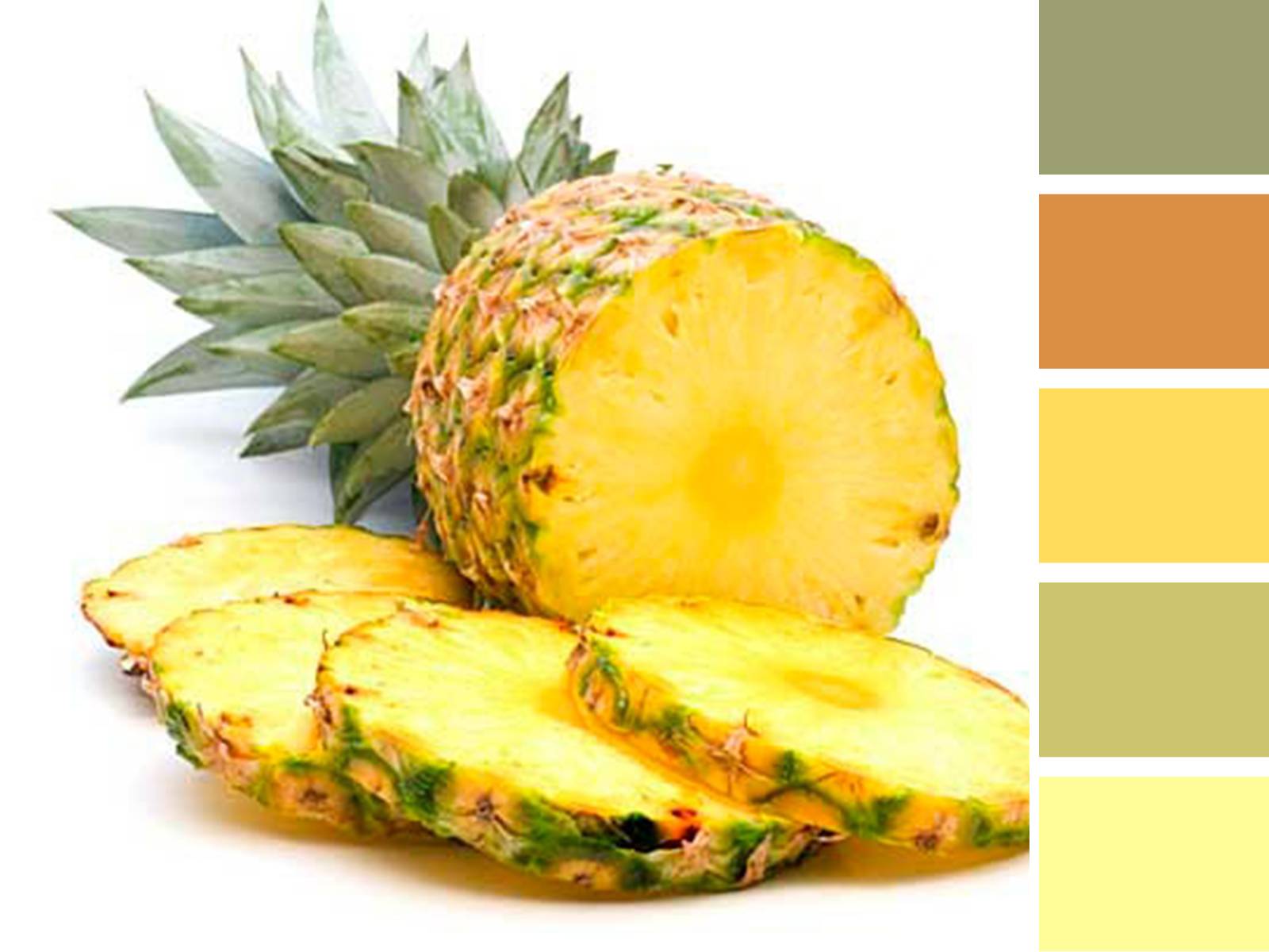
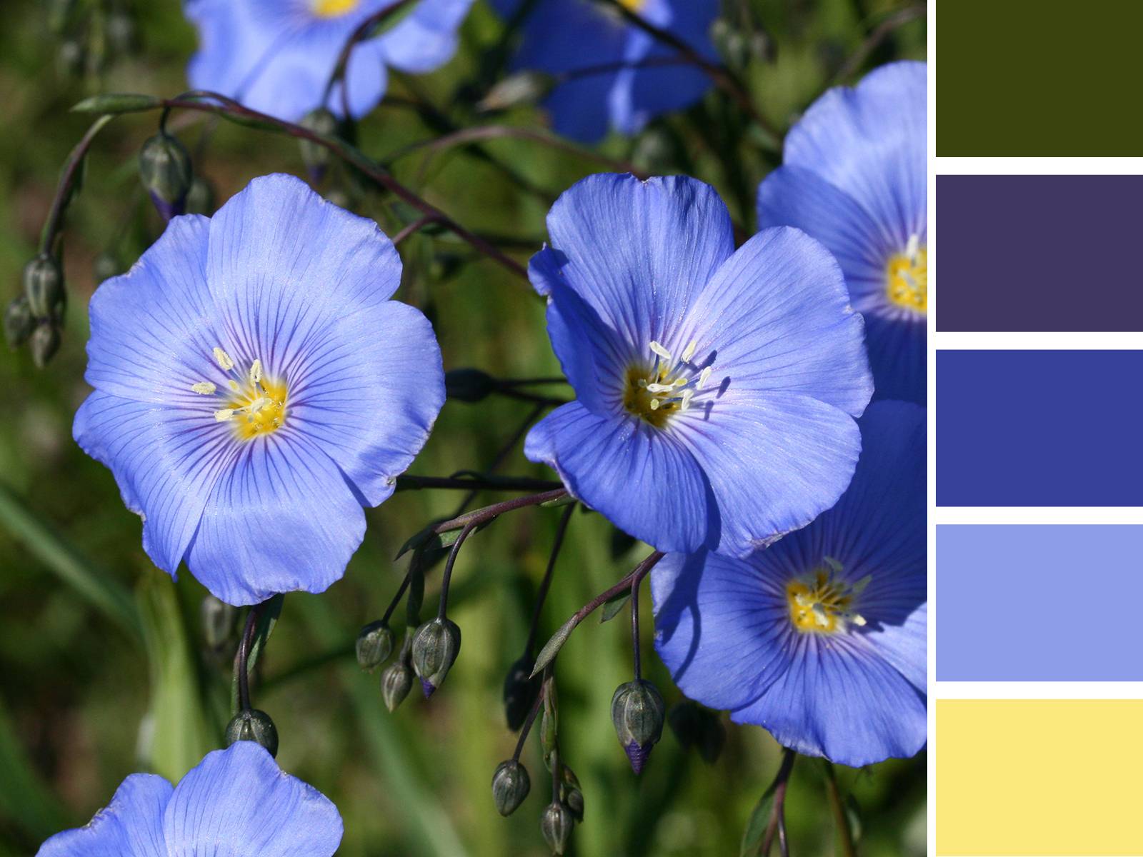
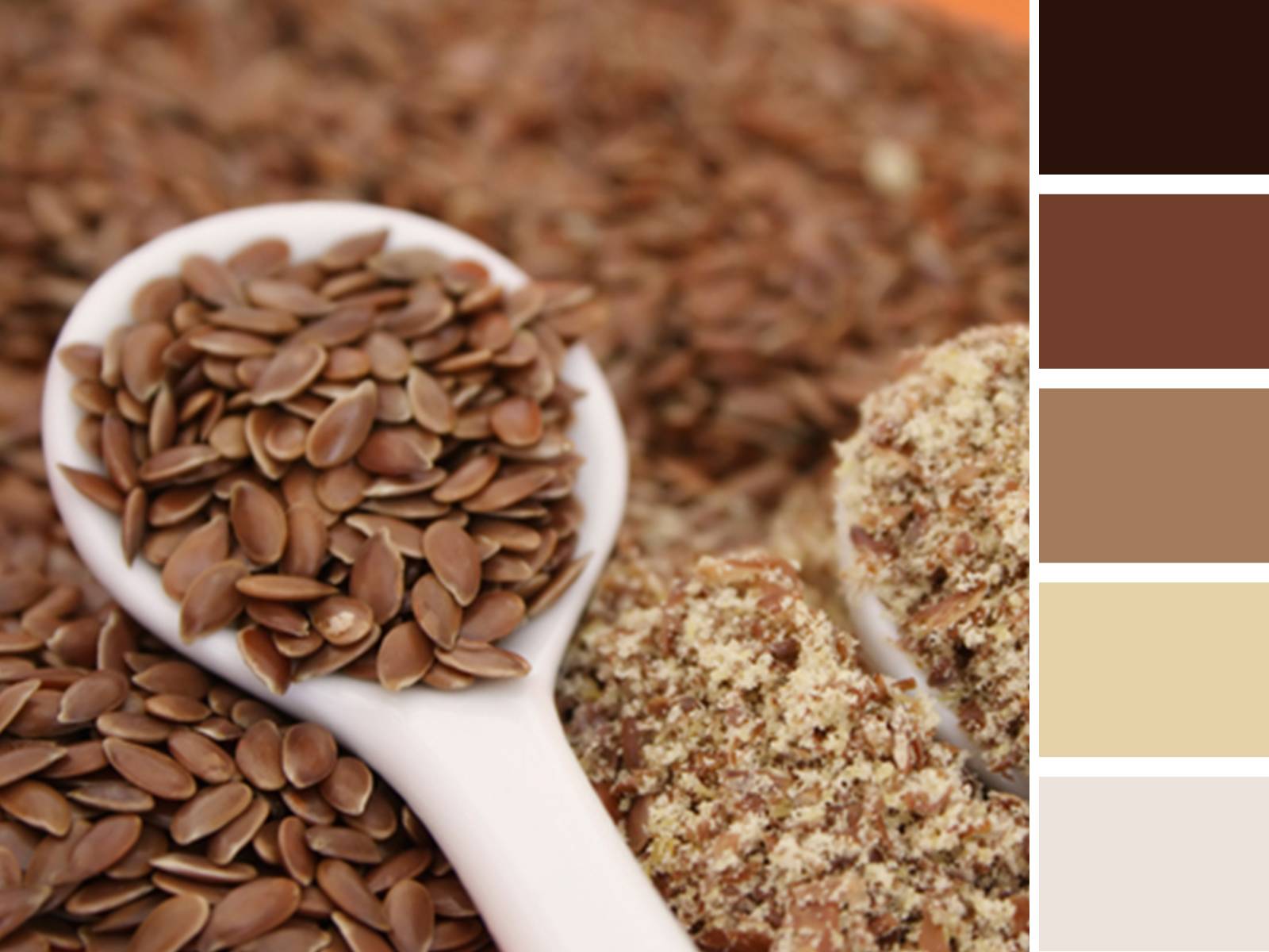
Take a look at the above pics as well as the colors listed towards the right. Doesn’t it seems appealing to the eyes? This is how we can obtain a simple yet attractive palette from an ordinary picture. The idea is to select an eye pleasing picture (preferably something of nature) and to pick the most vibrant colors (or most noticeable colors) among them to form the required palette. A palette formed in this manner will have a higher probability of being more pleasing to the eyes of the user. Also, there are a lot of websites on the internet providing “ready ready-made” color palettes. Eg : Toucan, Adobe Kuler etc.
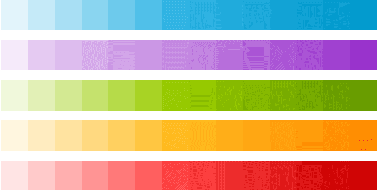
These color palettes are available free of cost and can be easily implemented into our designs without much effort. The site provides hex codes of the colors which can be easily transferred to our designs.
Changing trends in color combinations
Though the above procedure is a good way to obtain a perfect eye pleasing color combination, we also need to keep in mind the changing trends in color selection. You can get to know this by browsing new articles about color trends, browsing through new websites and apps etc. Once you get to know the trend then the above procedure will be very handy to get a good color set for applying in your next project.
As of now minimalistic design is in trend and when it comes to colors, subtle color combinations are preferred. There are no more shadows and stuff in designs and everything is flat in style. With the arrival of flat design trend, simple flat colors also find its place in modern designs. EG. Take a look at the home page of Skype http://www.skype.com/en/. You’ll find what is explained earlier. The buttons are flat in appearance with a single color, as well as the other icons. All this brings simplicity in the designs and the websites become easy to understand and browse. Once you decide on a palette it becomes easier to design for these websites/apps.
- Share this